

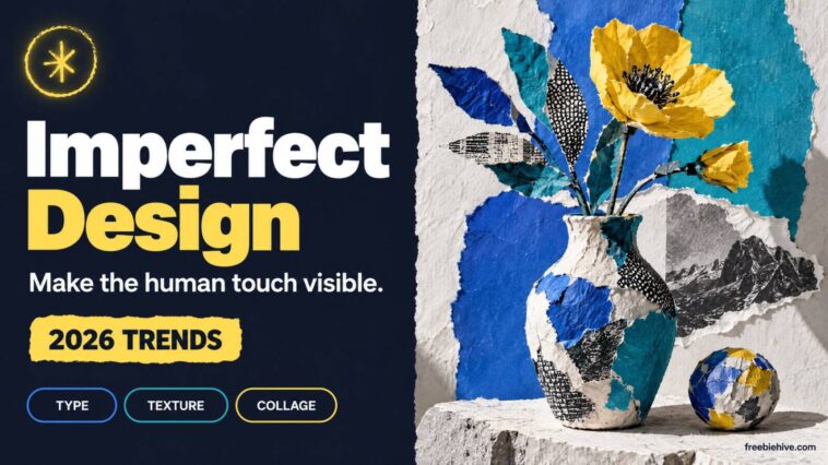
Imperfect design · Graphic Design · 2026 visual trends
The strongest handmade-looking work in 2026 is not messy for its own sake: it uses visible human choices to give a design a point of view.
Imperfect design keeps visible human decisions in the work. Uneven letters, paper grain, hand-cut edges, collage, and loose layouts can make a visual feel specific rather than machine-smoothed. For 2026, forecasts from Adobe and Canva point to tactile surfaces, expressive type, and personal work. Still, these are forecasts from their teams. They do not prove rough-looking design always beats polished alternatives.
This distinction matters to freelance designers, small-shop owners, and students. They must decide whether to follow a trend or build a recognizable style. So ask, “Which human choice makes this message memorable, and what must remain clear?” rather than, “How do I make this look imperfect?”
Imperfect design is the signal, not the finish
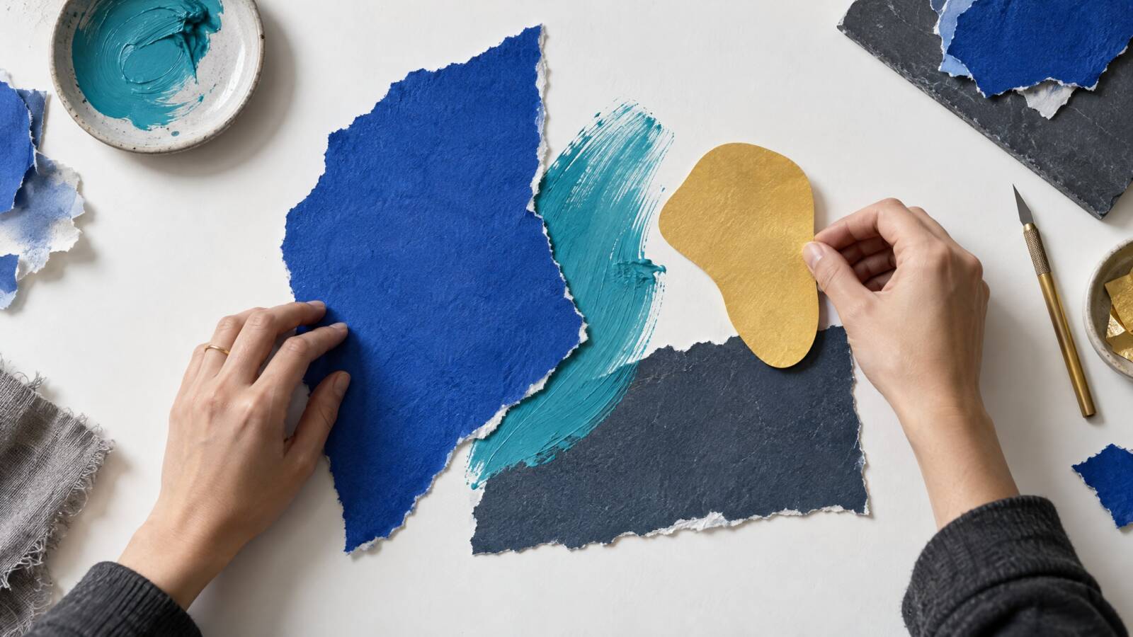
“Imperfect” can describe work that shows how someone made it. Examples include a scanned paper edge, a slightly misregistered print layer, a hand-drawn underline, or a collage of unlike materials. The mark is intentional. By contrast, random clutter, weak contrast, and distorted body copy do not signal authenticity. They create obstacles unless they carry meaning.
For example, consider a café menu with one imperfectly inked illustration. Now compare it with a menu where every price is hard to read. The first detail can suggest craft. However, the second frustrates customers. Therefore, let the visual treatment reinforce the subject. Do not ask the audience to excuse avoidable confusion.
This authorship test works better than copying a specific look. A community bookstore might use a hand-stamped motif to feel personal and local. By contrast, a finance app may need a more restrained system. It could use a tactile accent in a campaign instead of roughening every screen. In both cases, imperfect design should reflect the project, not just a popular effect.
Why imperfect design feels human
Although their labels differ, the 2026 forecasts share a recognizable mood. Adobe Express lists organic and imperfect design, playful type, freeform layouts, and collage. Meanwhile, Canva calls its umbrella theme “Imperfect by Design” and describes textures, zine references, and unfinished-looking compositions. Adobe’s separate Creative Trends report also highlights sensory imagery, emotional connection, surreal play, and local cultural expression.
These reports come from companies with design tools and creative platforms. So treat them as informed forecasts, not neutral measures of what every audience prefers. Canva says its 2026 forecast draws on search activity from its creator community, its Designer Advisory Board, and a survey of 1,000 creators. In that survey, 80% said 2026 is the year they regain creative control. Also, 77% described AI as an “essential partner.” Those figures represent Canva’s respondents, not all designers or consumers.
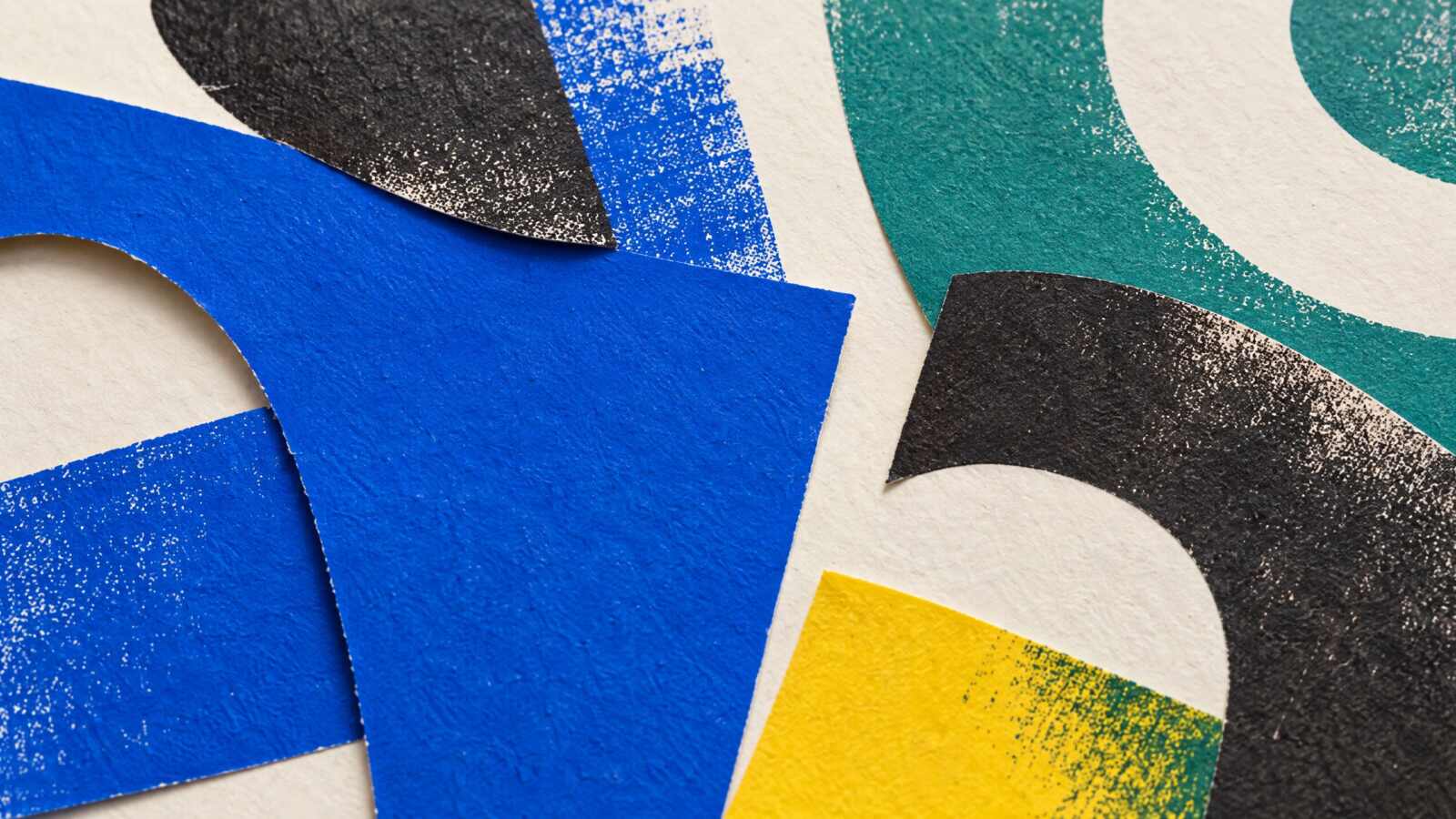
In addition, an independent review by It’s Nice That, published in January 2026, adds another perspective. It describes photocopy-like grain, layered collage, collected visual assets, and utilitarian micrographics. The article reflects on work seen over the previous year. It does not present a strict forecast. Taken together, the sources suggest renewed interest in authored decisions, not a rejection of digital tools.
For working designers, this creates both an opportunity and a trap. Texture can make a generic layout feel specific. However, a borrowed “handmade” filter can become another template. Imperfect design feels personal when its marks come from the project’s story, materials, or audience.
Imperfect design works when it has a job
First, name the feeling or information the design must communicate. Then choose one or two irregular elements that support it. A hand-cut edge might suggest a community noticeboard. Photocopy texture may suit a gig poster. An uneven display typeface can make a student zine feel direct. Strong imperfect design starts with purpose, not a filter.
Next, use this three-question check before committing:
- Does the mark connect to the subject? Give handmade texture a reason to belong in the identity, campaign, or publication.
- Does it create hierarchy? Let texture or expressive type draw attention to the most important element. Do not make every element compete.
- Can the design still work without it? If removing the effect changes nothing, it may be decoration rather than a meaningful choice.
In practice, this framework helps teams discuss taste without arguing about whether a design “looks cool.” Compare two versions at the size the audience will see. For instance, test a textured headline against a clean one, or a layered collage beside a simpler arrangement. Ask a few real readers what they notice first and what they think the piece is about. This is a practical project check, not statistically representative audience research.
A repeatable workflow for imperfect design
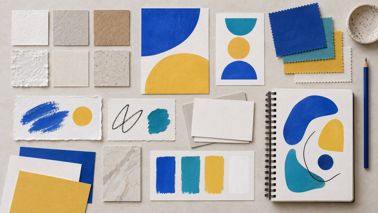
Before opening a template or adding effects, gather a small set of original ingredients. This keeps the work personal and gives you material to reuse across formats. For imperfect design, start with things connected to the project rather than a generic texture pack.
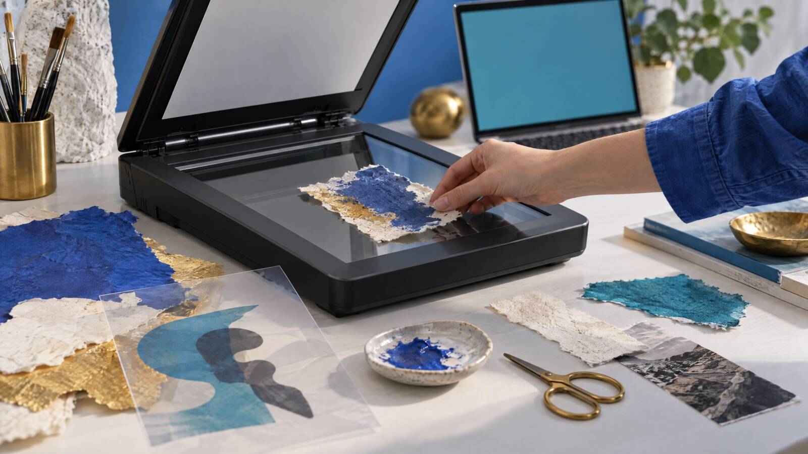
- Start with the message. Write one sentence about what the audience should understand, feel, or do. Then choose the format and reading distance, such as a phone post, shop poster, package, or editorial page.
- Make raw material. Photograph or scan paper, fabric, paint, pencil marks, packaging, or project-related objects. Draw several marks by hand. Next, pair a sturdy, readable text face with a more expressive display face.
- Compose in layers. Set the main message first. Add one strong tactile element. Add another only if it improves the story. Use overlap, cropping, or asymmetry to create movement. Avoid scattering details everywhere.
- Test and refine. Review the design at thumbnail size and at its intended size. Check contrast, spacing, and how quickly people can read key text. Finally, remove effects that obscure the content.
- Save a reusable kit. Keep source scans, transparent marks, paper textures, color swatches, and font notes in clearly named folders. Also, record each asset’s origin and license before sharing or selling it.
As a result, freelancers can turn this process into a repeatable brand system. They can build a small library of custom marks, set a texture range, and decide when expressive type appears. A shop owner can keep the process simple. For example, use one handmade stamp or background across seasonal social posts and packaging inserts.
Keep imperfect design tactile, clear, and reusable
For accessibility, imperfect design must do more than look intriguing at full size. Its essential message should survive when someone reduces it for a feed, prints it in grayscale, or views it with low vision.
For example, the W3C’s WCAG 2.2 Level AA contrast criterion sets a minimum ratio of 4.5:1 for normal text and 3:1 for large text. These thresholds offer a practical starting point for type over paper grain or busy collage. However, they do not guarantee that every unusual typeface feels comfortable to read. Keep essential copy in live text where possible. Also, avoid distressed display lettering for paragraphs, instructions, or prices.
Finally, make the resource kit usable by someone other than its creator. Name files by content and format. Keep clean originals beside edited versions, and note font or texture licenses. Designers can pair their own scans with free design resources from FreebieHive. For quick browser-based layouts, the FreebieHive design studio is another option. Either way, check each asset’s license. A free download is not automatically cleared for every commercial use.
That is the durable opportunity behind imperfect design: process becomes part of the resource library.
Meanwhile, a signature mark can travel across a poster, product card, and social image without making every piece look like the same preset. In other words, imperfect design can become a system of repeatable choices, not a one-off treatment.
Frequently asked questions
What is imperfect design?
Imperfect design deliberately keeps visible traces of making, such as hand-drawn marks, uneven print, tactile surfaces, or collage. These details support the message. It is a design choice, not a synonym for careless execution.
Does this style mean avoiding AI?
No. Both Canva’s 2026 forecast and Adobe’s trend coverage discuss AI alongside human-led visual expression. Designers can use AI to explore or produce ideas. They still make distinctive choices about selection, editing, context, and finish.
How can a small brand use this style?
Choose one or two repeatable details tied to the brand’s products or community. These might include a custom stamp, original paper texture, or expressive headline style. Keep essential information legible. Then test the system on the formats customers actually use.
What resources help create a handmade look?
Start with original scans, photographs, brush marks, paper textures, and licensed fonts. Save editable source files and note usage rights. That way, you can reuse materials safely across print and digital work.
Sources & Further Reading
- Design trends for 2026 — Adobe Express — Supports discussion of imperfect design, type, collage, and freeform layouts.
- Innovation and authenticity — Adobe’s 2026 Creative Trends forecast — Outlines Adobe’s four themes and research basis.
- ‘Imperfect by Design’: The visual design trends set to define 2026 — Canva — Details Canva’s forecast, styles, and creator survey.
- The graphic trends you’ll want to bookmark for 2026 — It’s Nice That — Offers independent observations on imperfect, mixed-media work.
- Understanding Success Criterion 1.4.3: Contrast (Minimum) — W3C WAI — Supports the WCAG 2.2 AA thresholds above.
Editorial note: Trend forecasts are attributed to their publishers; Canva survey figures describe Canva’s respondents, not all creators. Accessibility guidance is summarized from the linked W3C source.